I'm super excited to begin sharing some of my inspirations behind the colorful refinishes I've been working on. I am so blessed to be able to enjoy the beauty of nature and outdoors, and have been able to capture a few of those moments on film.. well ok, digitally. I'll be adding some inspirations to my before-and-after posts, but also have a few projects that don't have their own posts, so I'll share them here! Be sure to click on the "Color Story" label to see more!
First, a gorgeous Bombay console table painted in Annie Sloan Antibes green (over a shimmery cola color by Martha Stewart interiors), distressed, and with clear and dark waxes.
Click below to see more!
Friday, May 8, 2015
Thursday, May 7, 2015
Before and After : Vintage Writing Desk
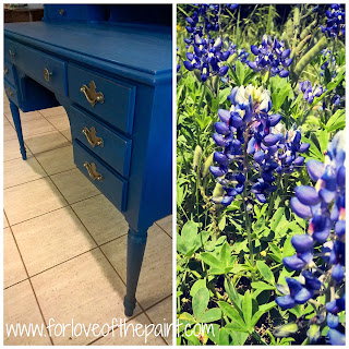
I have been absolutely obsessed with photography lately! (Shameless plug - follow me on Instagram @forloveofthepaint to share my art and inspiration). So I decided to capture some of my inspirations and put them side-by-side with the before and after series for you to enjoy! The first is a gorgeous desk redo in Annie Sloan Chalk Paint - Napoleonic Blue. For those of you who don't know, I am trying to use a new color every month this year, and pretty sure I'm on track with # 5 here!
I did a very light distressing on the paint, then clear and dark waxes. I'm super excited about the gorgeous blue! And here's the Color Story: Inspiration behind it... Bluebonnets! Can't love a Texas spring without the requisite bluebonnet photo :) There is literally nothing quite like that rolling field of blue.
What do you think? Love it? I'll be putting together more color stories in the coming weeks. I look forward to sharing them with you!!
Friday, May 1, 2015
Before and After : 5 Drawer Vintage French Provincial Chest of Drawers
This gem was a great find, and it was just missing its handles. It actually was being used with standard round cabinet knobs, but the previous owner had some of the original handles. One, however, was broken. I was able to find a very close match on Etsy (ummm love Etsy, and they don't pay me to say that!). However, I thought it wouldn't look *quite* right since they weren't an exact match. Since the chest has 5 drawers, separated by a midline, I decided to order 2 of the replacement pulls for above the midline, and use the 3 original for below. It worked out to make the shapes look very cohesive and natural for this piece! However, the colors were a little different. The client wanted a distressed look to the handles, but with the different color metals, I decided to first spray paint the pulls all the same color, THEN do a color wash over them. Eureka! We were on to something.
The client picked Annie Sloan Chalk Paint in Pure White, and Paris Grey. She also selected brushed nickel with a Pure White wash for the handles. Here's the before and after of the chest:
The hardware looks like it totally belongs, I think! Beautiful :) Here's how I achieved that cohesive look:
Before: notice the very slightly different shape and patina to the hardware. I cleaned them well and laid them in a wide flat box so I could get them all with even passes with the spray.
Step 1: several super light coats of Rustoleum spray paint, dried overnight.
Step 2: dry brush of the color overlay (Pure White, in this case).
I started by doing an actual wash of color, but it wasn't adhering to the hardware the way I wanted, so I wiped it off well and changed tactics to the dry brushing with barely any paint on the brush. I gradually built up color over about 3 passes per handle until it looked just right. Et Voila! I this it's gorgeous and sophisticated, and just exactly what the client envisioned. What could be better?
Subscribe to:
Posts (Atom)


